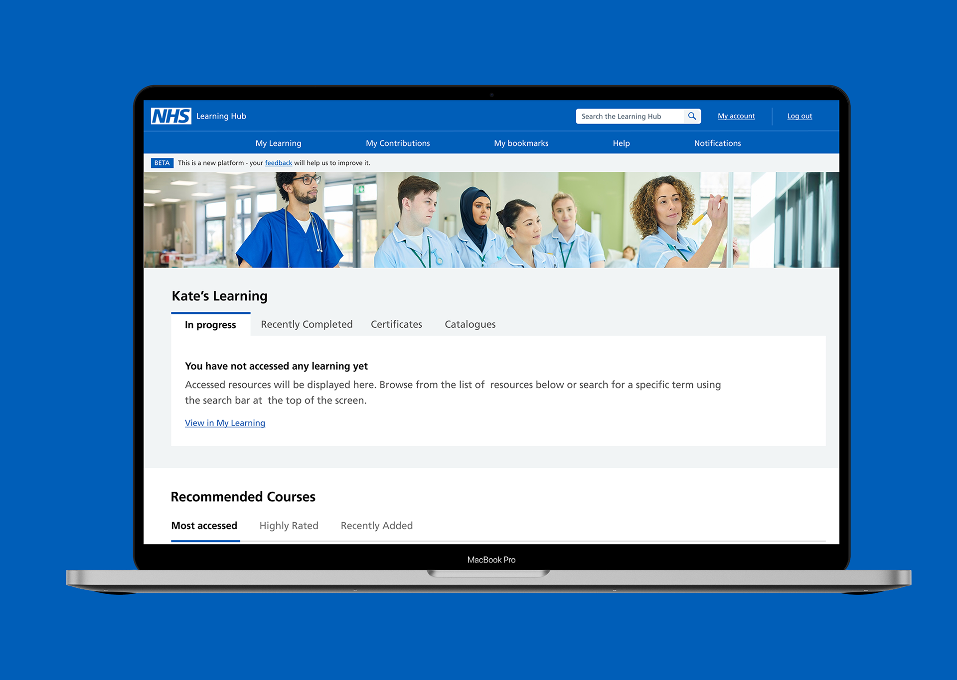
The NHS Learning Hub is a platform for healthcare professionals, providing them with training materials and learning opportunities to enhance their skills and knowledge.
As part of a personal project, I improved the Learning Hub by simplifying the homepage, improving the course navigation, in-course information, and creating a more modern, personalised interface.
My Role
Market research, user research, usability testing, wireframing, information architecture, user experience and user interface design.
Market research, user research, usability testing, wireframing, information architecture, user experience and user interface design.
Impact
The redesign created a clearer, more engaging, more engaging learning experience by reducing friction in course discovery and navigation, giving users more useful information upfront and making the platform feel more modern and motivating to use.
The redesign created a clearer, more engaging, more engaging learning experience by reducing friction in course discovery and navigation, giving users more useful information upfront and making the platform feel more modern and motivating to use.
Research
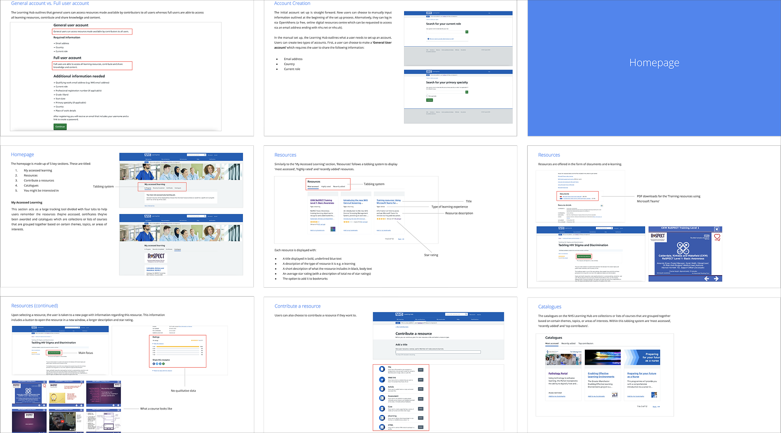
I began the discovery process with research. This involved gathering the information about the Learning Hub that already exists, as well as gathering new information using a heuristic evaluation.
I began the discovery process with research. This involved gathering the information about the Learning Hub that already exists, as well as gathering new information using a heuristic evaluation.
User Testing
Since all of the observations I had made about the Learning Hub were my own at this point, the next step was to test these assumptions to see whether they could be validated.
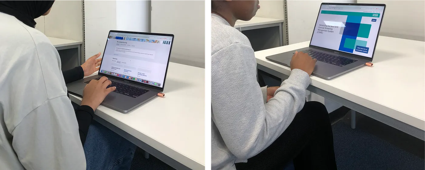
I tested the Hub with full-time NHS employees whose ages ranged from 26-31. My main findings were as follows:
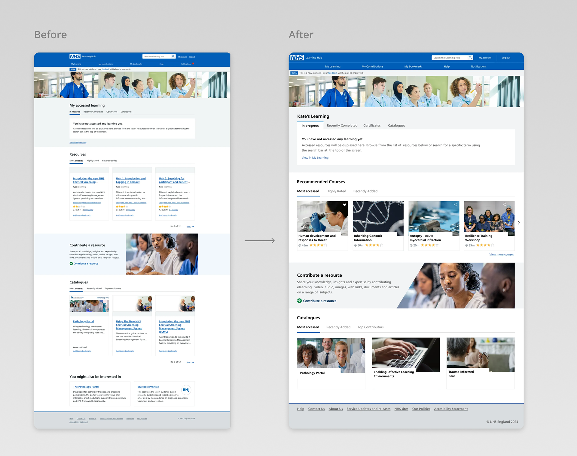
1. The homepage was visually bland. Many users disliked the large amount of text and little imagery which resulted in a general dislike and lack of motivation when looking at the homepage.
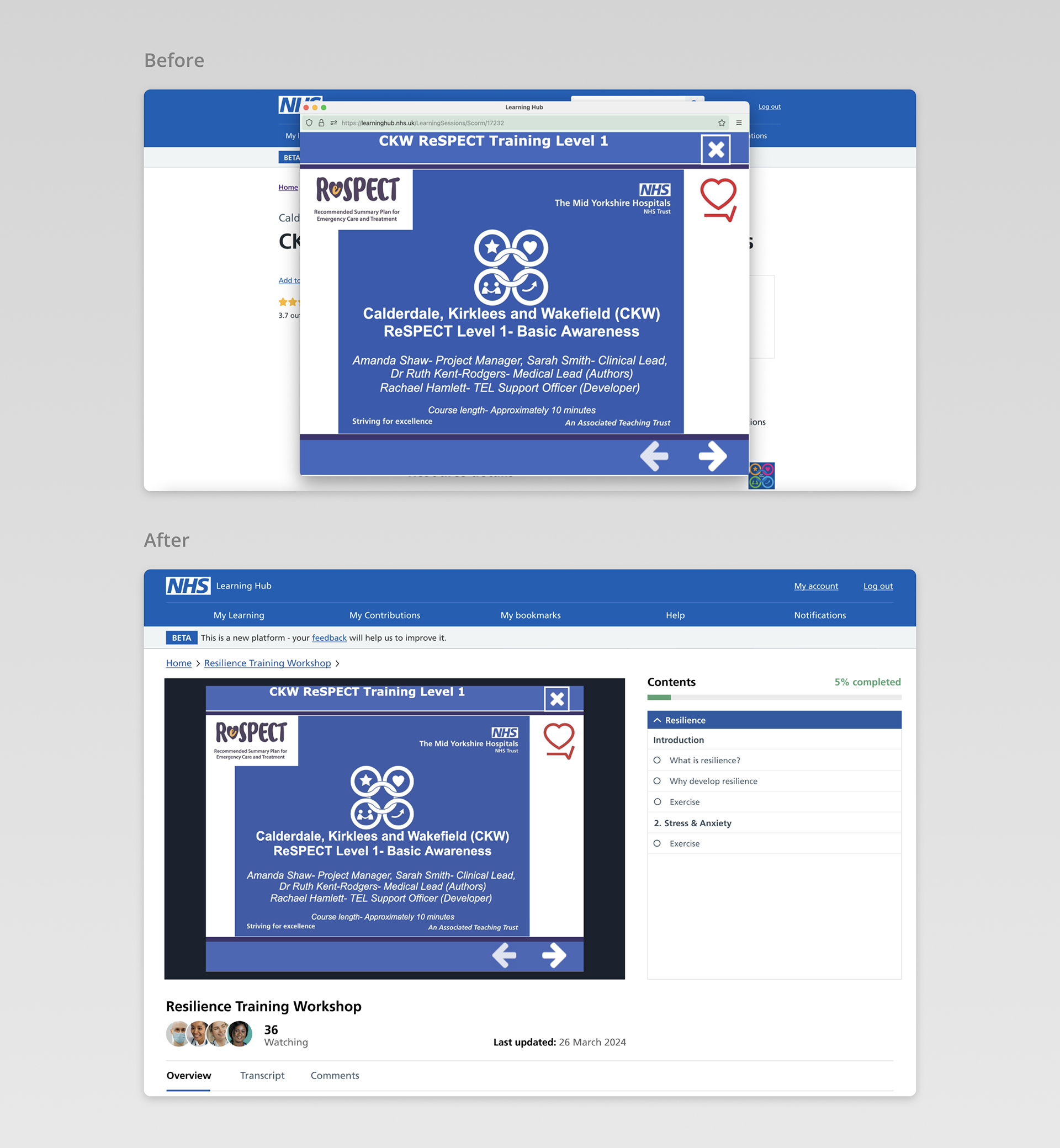
2. There was a strong dislike for the course pages and how these pop out in a separate window.
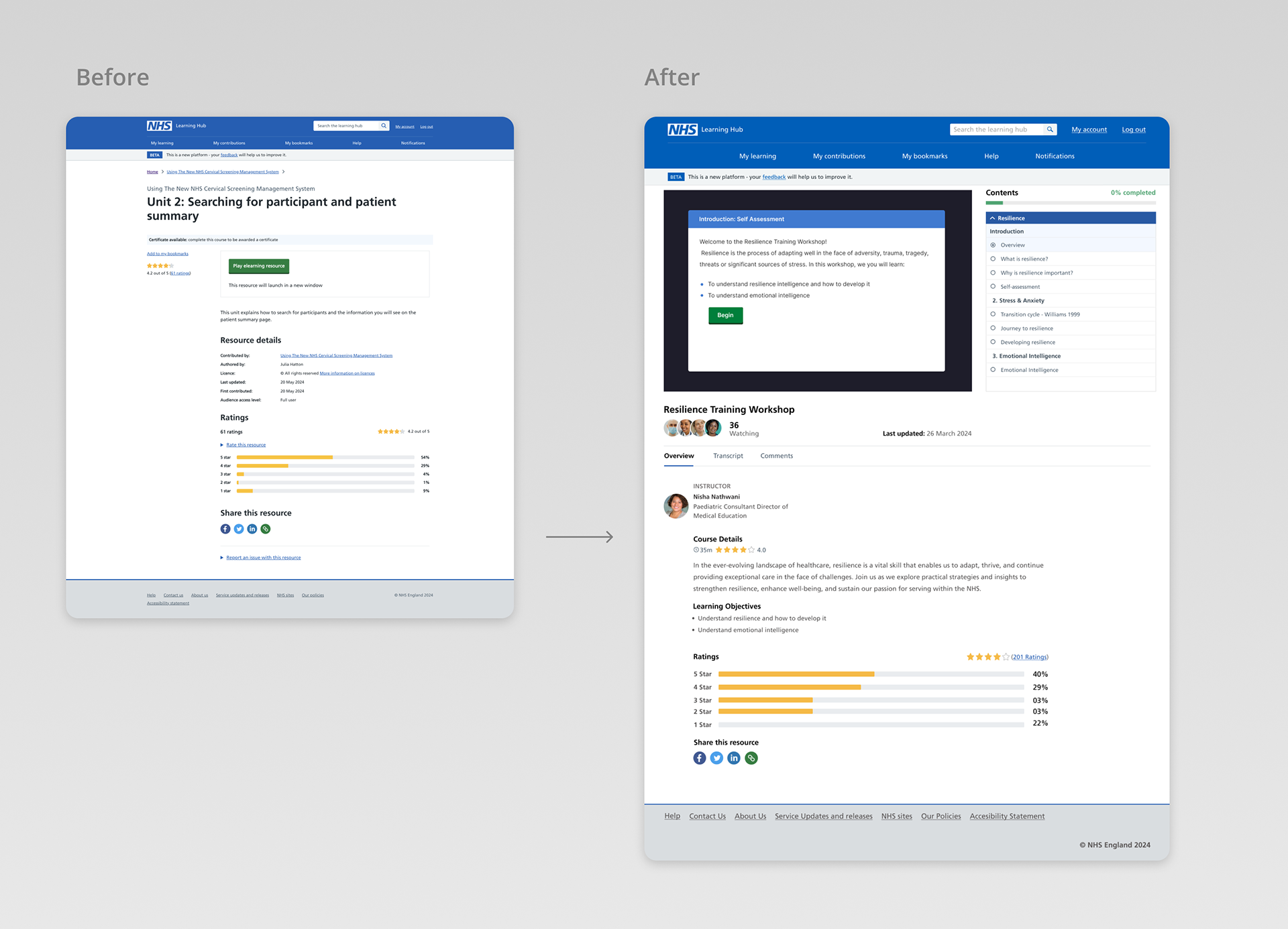
3. Course pages looked outdated with all testers describing them in a negative way such as "old", "ugly" and "unmotivating".
3. Course pages looked outdated with all testers describing them in a negative way such as "old", "ugly" and "unmotivating".
Using the observations I gathered, combined with the findings from testing, I outlined some changes that would enhance the Learning Hub. For the homepage, the implementation of more images, less text and elements of personalisation.
For the course pages, adding relevant information to the page as well as integrating the course within the platform rather than a pop out window.
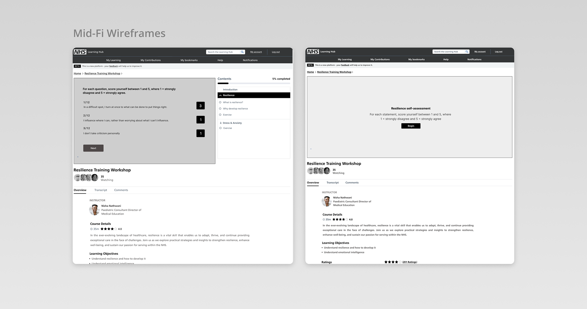
To plan these changes, I annotated all of the relevant screens, created some mid-fi wireframes which I tested with users. Then, after making amends and testing again, I completed my final designs.