The University of Surrey hired me as a UX/UI consultant to optimise the online experience UI. I worked independently with content, analytics and development teams to test new features and implement improvements across web and mobile platforms.
My Role
Market research, user research, usability testing, wireframing, information architecture and user interface design.
Market research, user research, usability testing, wireframing, information architecture and user interface design.
Impact
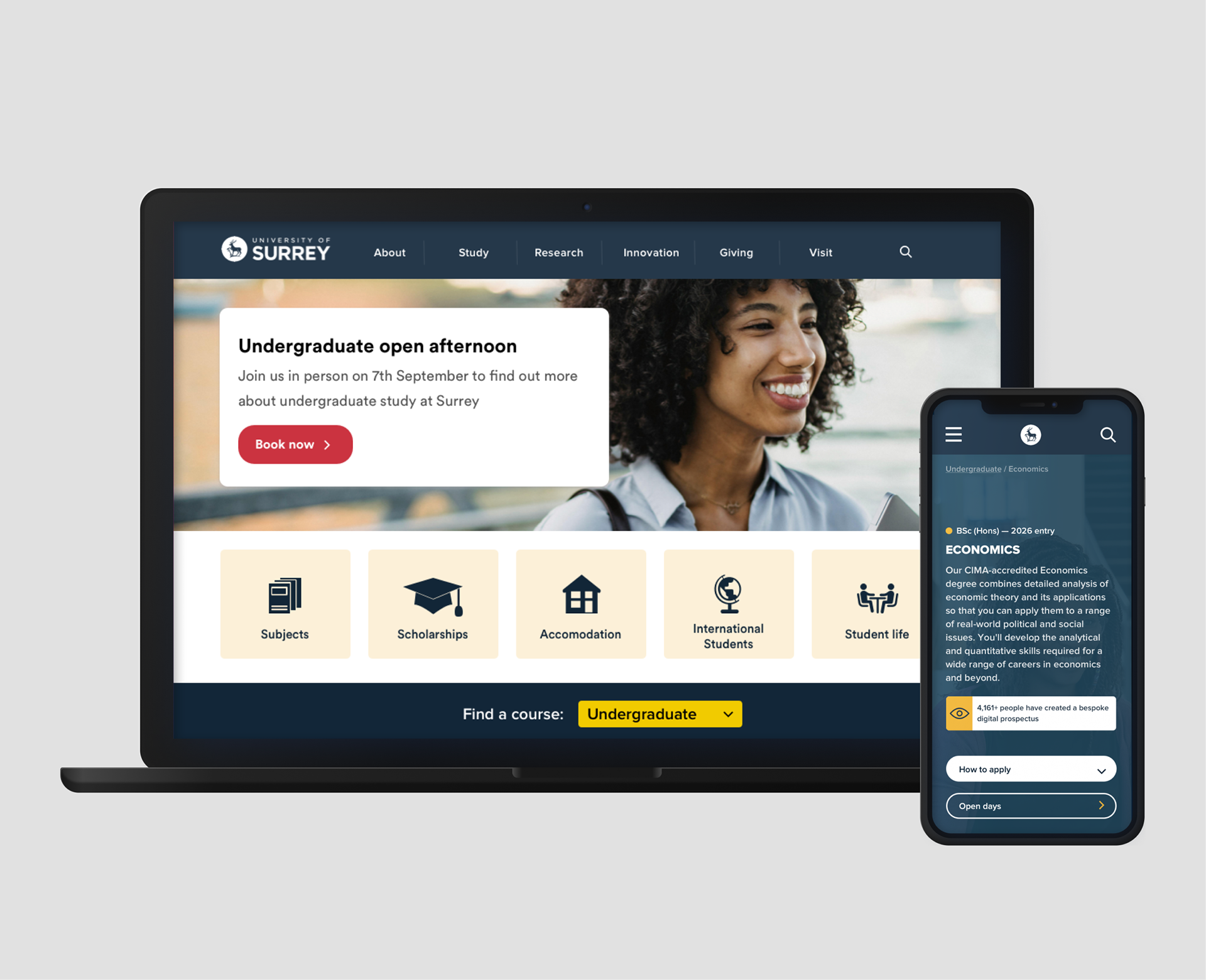
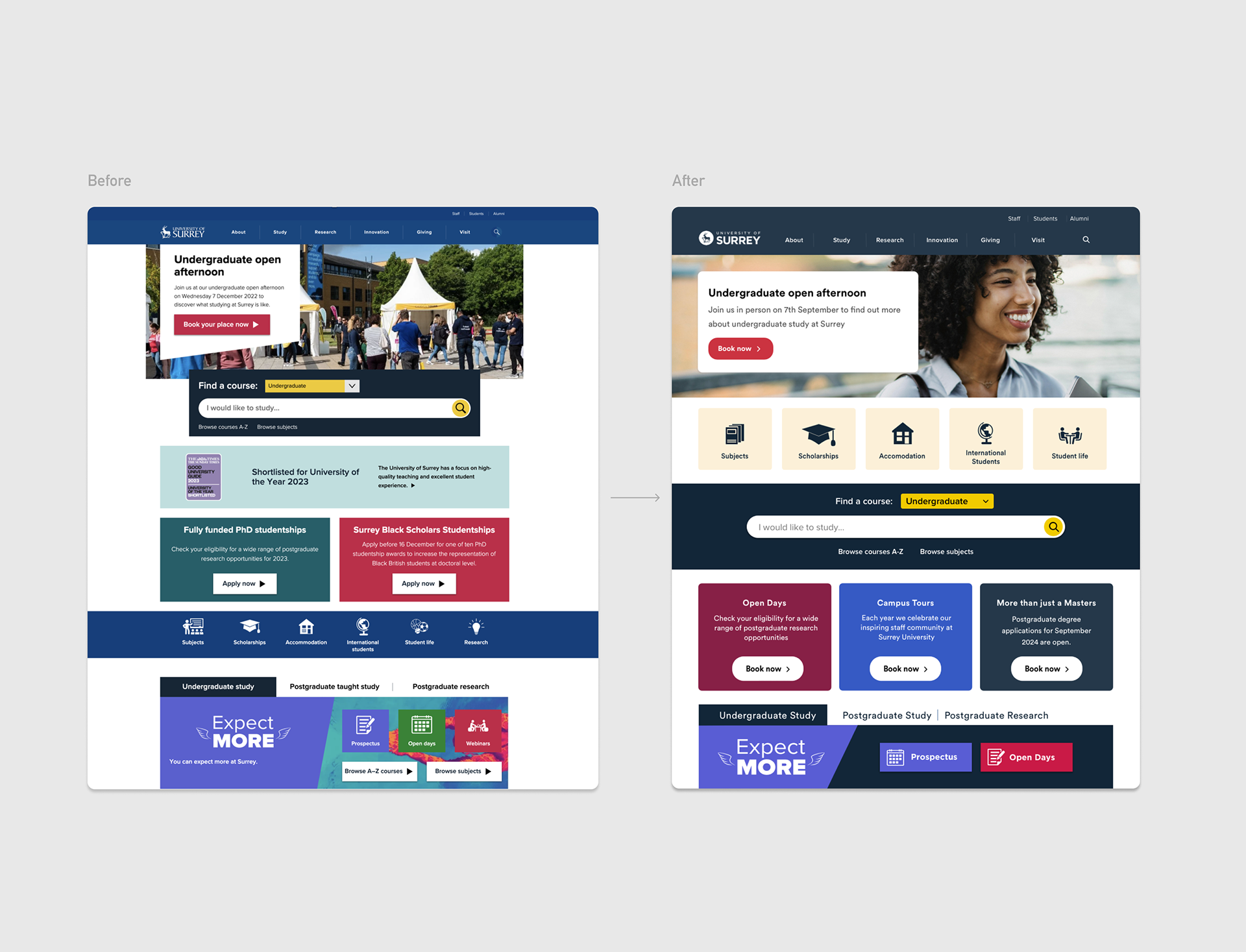
I improved the homepage by prioritising student-valued components and removed unused elements to create a clearer experience. I updated the colour palette to meet WCAG standards and standardised full-width components to strengthen visual harmony.
I improved the homepage by prioritising student-valued components and removed unused elements to create a clearer experience. I updated the colour palette to meet WCAG standards and standardised full-width components to strengthen visual harmony.
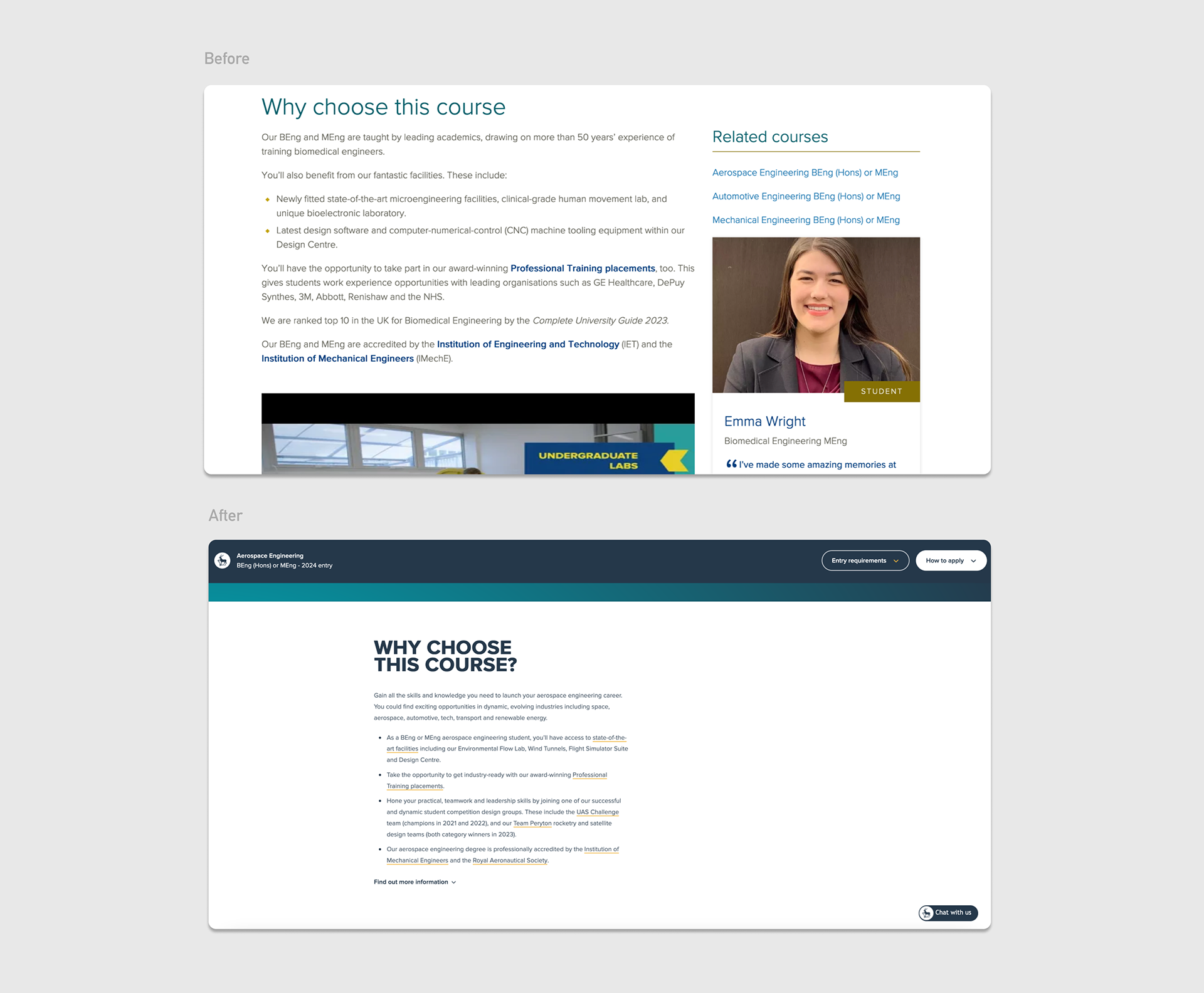
On the course pages, I reorganised the key information box and simplified the content to reduce cognitive load, improving accessibility, readability, and the overall user experience.
Research
Using my knowledge of UX best practices and laws combined with testing from analytical tools, I compiled my insights from my research into a report where I proposed the following changes:
Using my knowledge of UX best practices and laws combined with testing from analytical tools, I compiled my insights from my research into a report where I proposed the following changes:
For the homepage:
1. Prioritise components that were important to students.
2. Remove the ones that were not being used.
3. Increase visual harmony by making all components full-width and making the colour palette more harmonious.
1. Prioritise components that were important to students.
2. Remove the ones that were not being used.
3. Increase visual harmony by making all components full-width and making the colour palette more harmonious.
For the course pages:
1. Highlight key info which students can read from the get-go.
2. Enhance accessibility by removing bulky text and competing elements.
1. Highlight key info which students can read from the get-go.
2. Enhance accessibility by removing bulky text and competing elements.
Implementing changes: Homepage
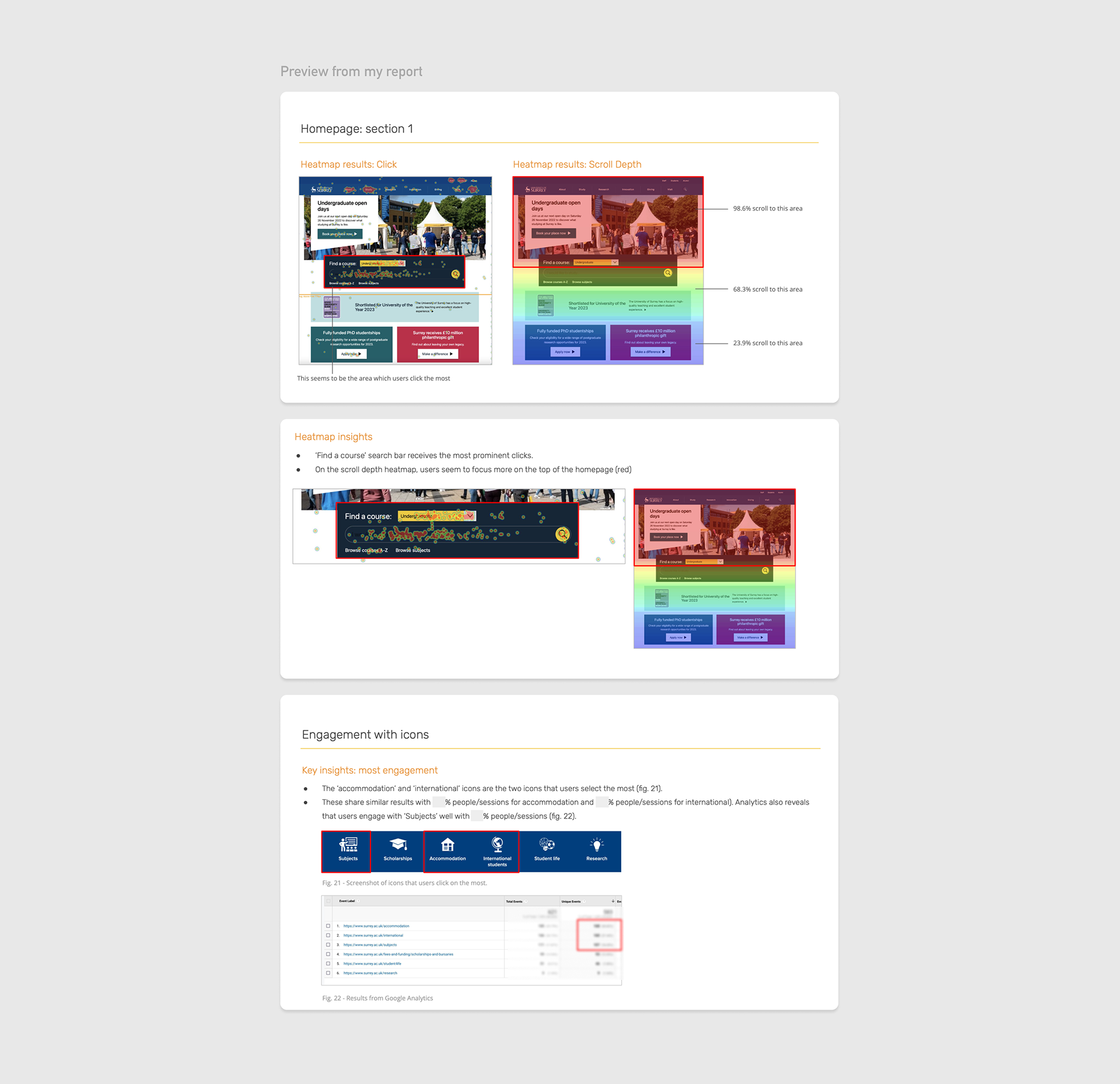
Click map results showed that the majority of engagement happened at the top of the page. However, results from Google Analytics showed that a high percentage of students were scrolling down to click on the blue bar with icons to access pages such as 'subjects', 'accommodation' and 'international students'.
I worked with developers to move all of the highly engaging components to the top of the page based on the insights from my report. I also enhanced the UI by making all components full-width and enhanced the colour palette to add visual harmony and meet WCAG standards.
Implementing changes: Course pages
The original course pages' key information was difficult to read due to its layout. To improve this, I implemented tabbing and iconography in two rows so that students can see the important information about the course from the get-go.
The original course pages' key information was difficult to read due to its layout. To improve this, I implemented tabbing and iconography in two rows so that students can see the important information about the course from the get-go.
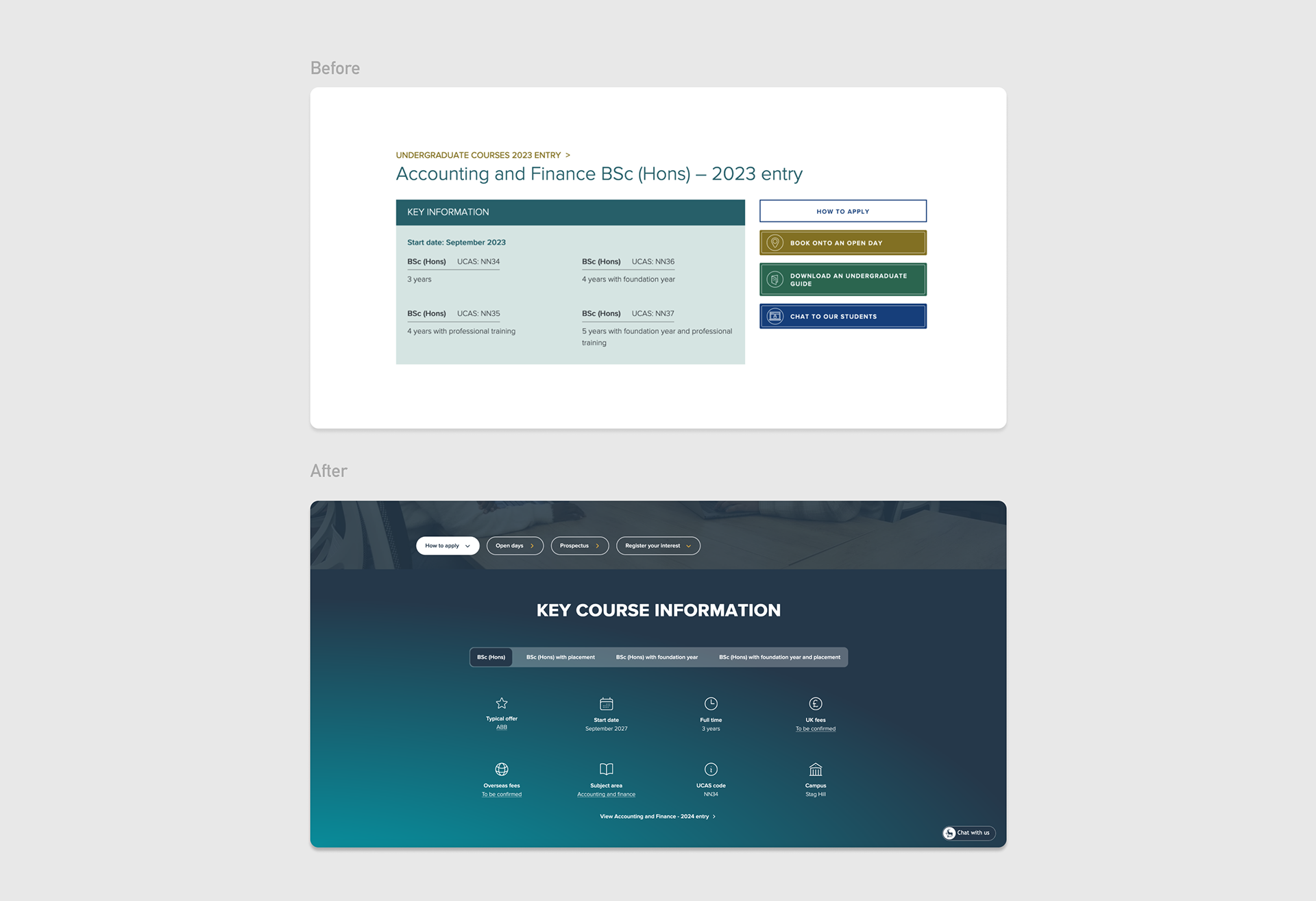
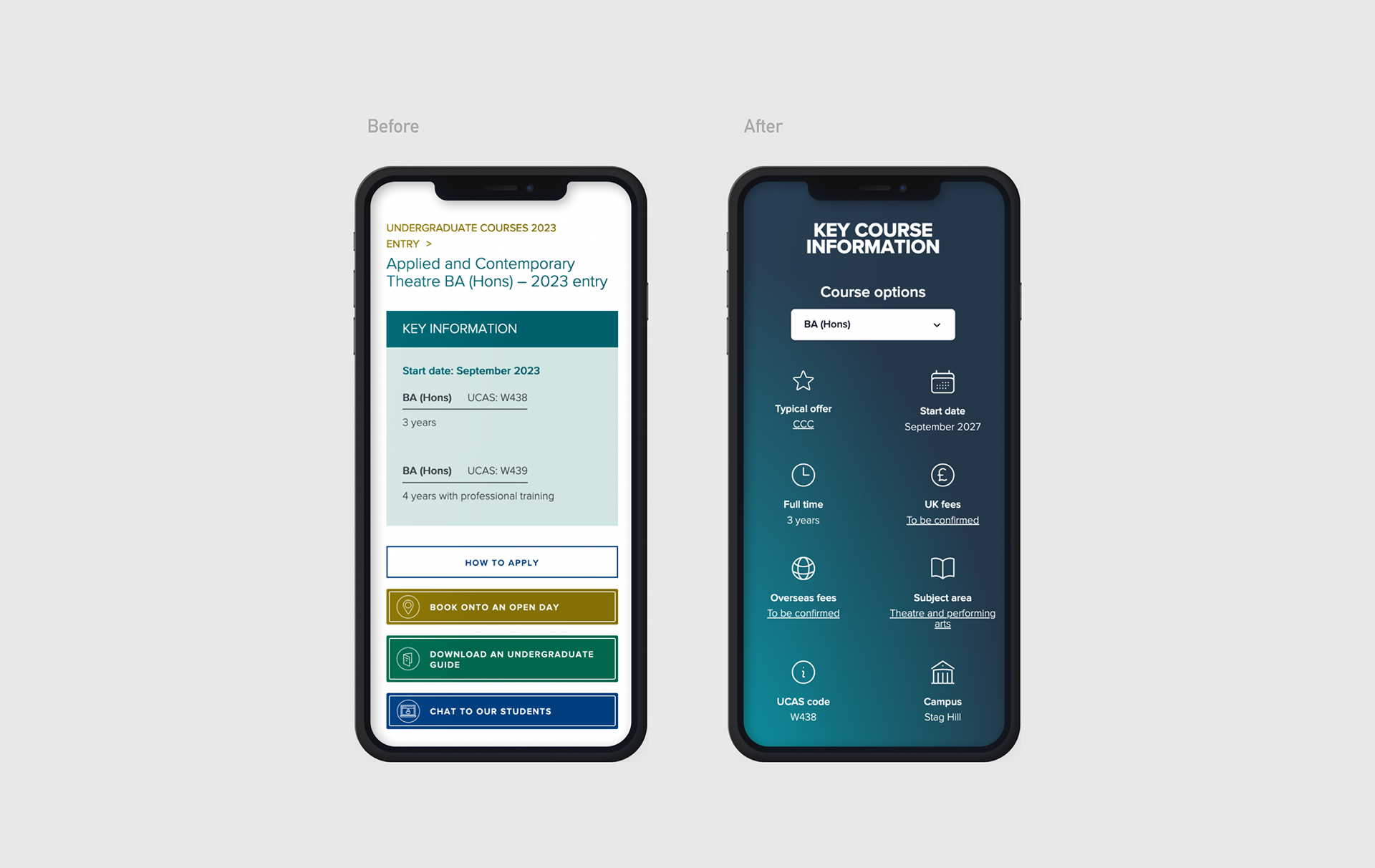
The original course pages contained a huge amount of information, which testing revealed was off-putting and overwhelming. To address this, we kept all of the key information in one place in a short paragraph and placed the content in the side column to the bottom of the page so that people can focus on one area of the page at a time.